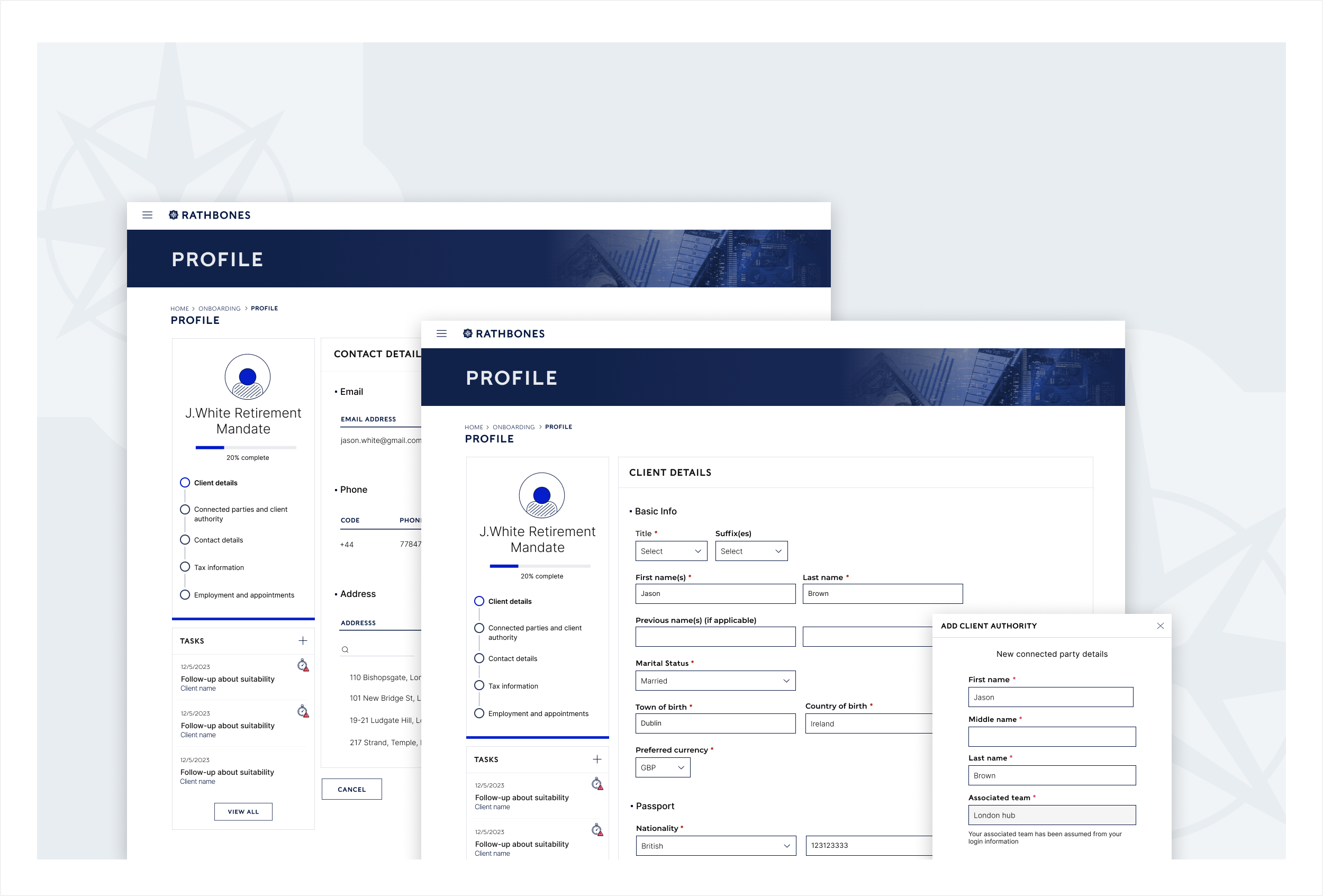
RB Design System
Just before I joined Rathbones, the company went through a rebranding process led by an external agency. However, due to the project's scope and the agency's focus on print, the guidelines for web, particularly web products were limited. Additionally, Rathbones typically relies on external vendors for digital products, which restricts the level of customisation and branding.
This create extra challenges for the Design System initiative. Not only I had to develop a new component library that aligned with somewhat vague recommendations for the branding agency, I also had to design it in a way that could be implemented by multiple external vendors.
The process
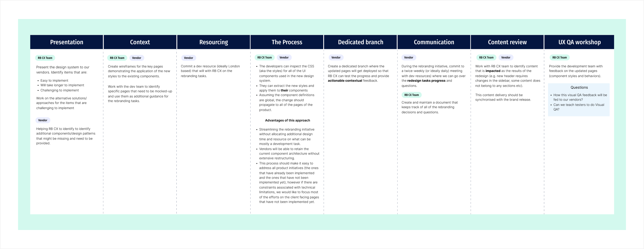
One of the first steps was defining a clear process and ensuring that both internal stakeholders and external vendors were fully on board with the approach.
Current components and usability
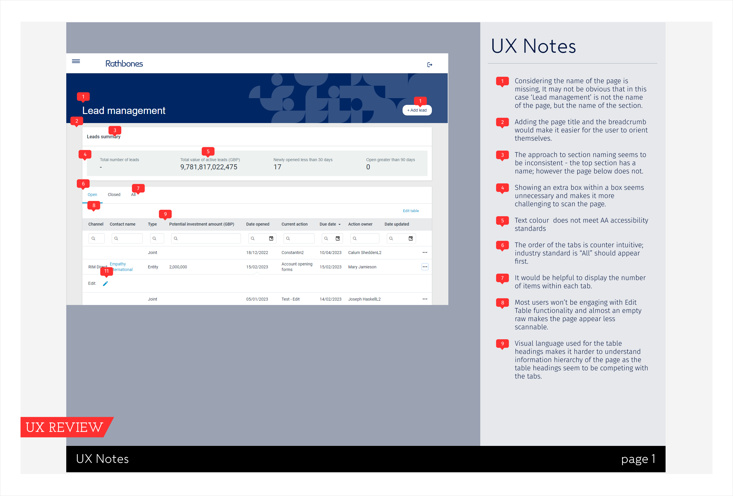
Before starting work on the actual components, I dedicated a considerable time to analysing the existing products, enumerating the components and carefully examining usability issues. Given that many Rathbones clients are over 65, accessibility was one of the key consideration points. As a result of this analysis, I created several detailed decks documenting the current UX issues.
Working on components
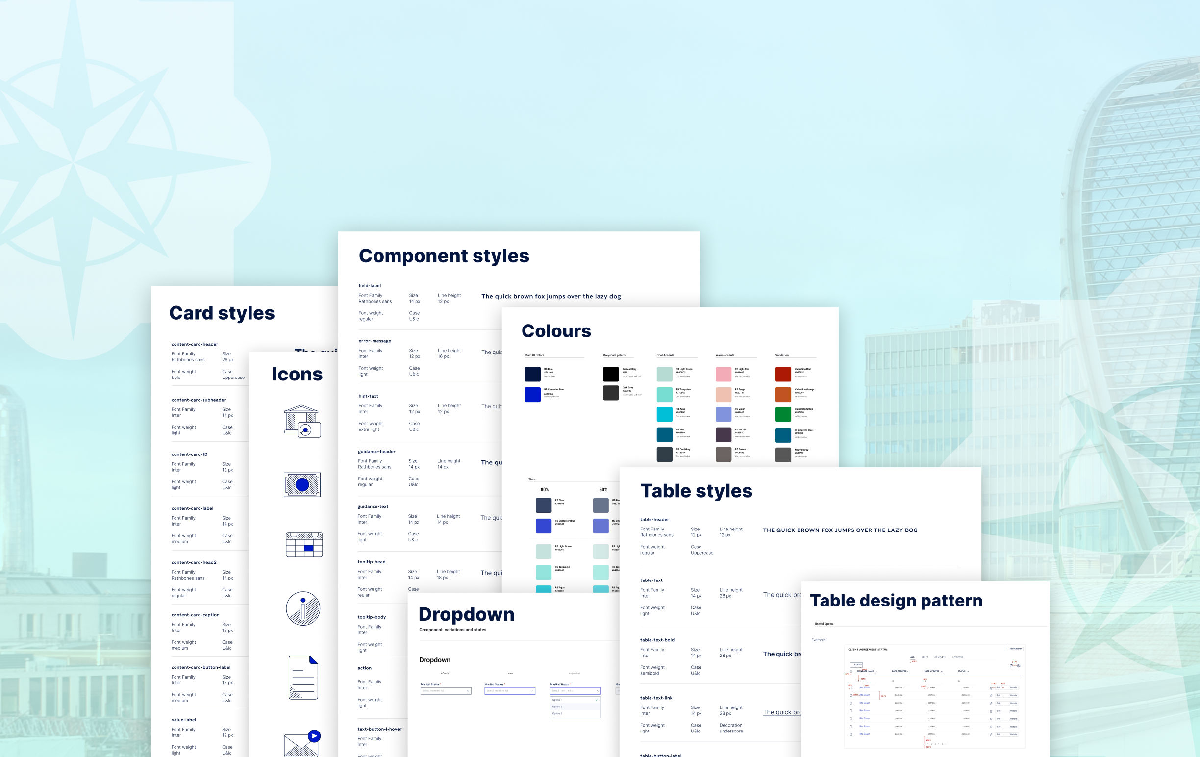
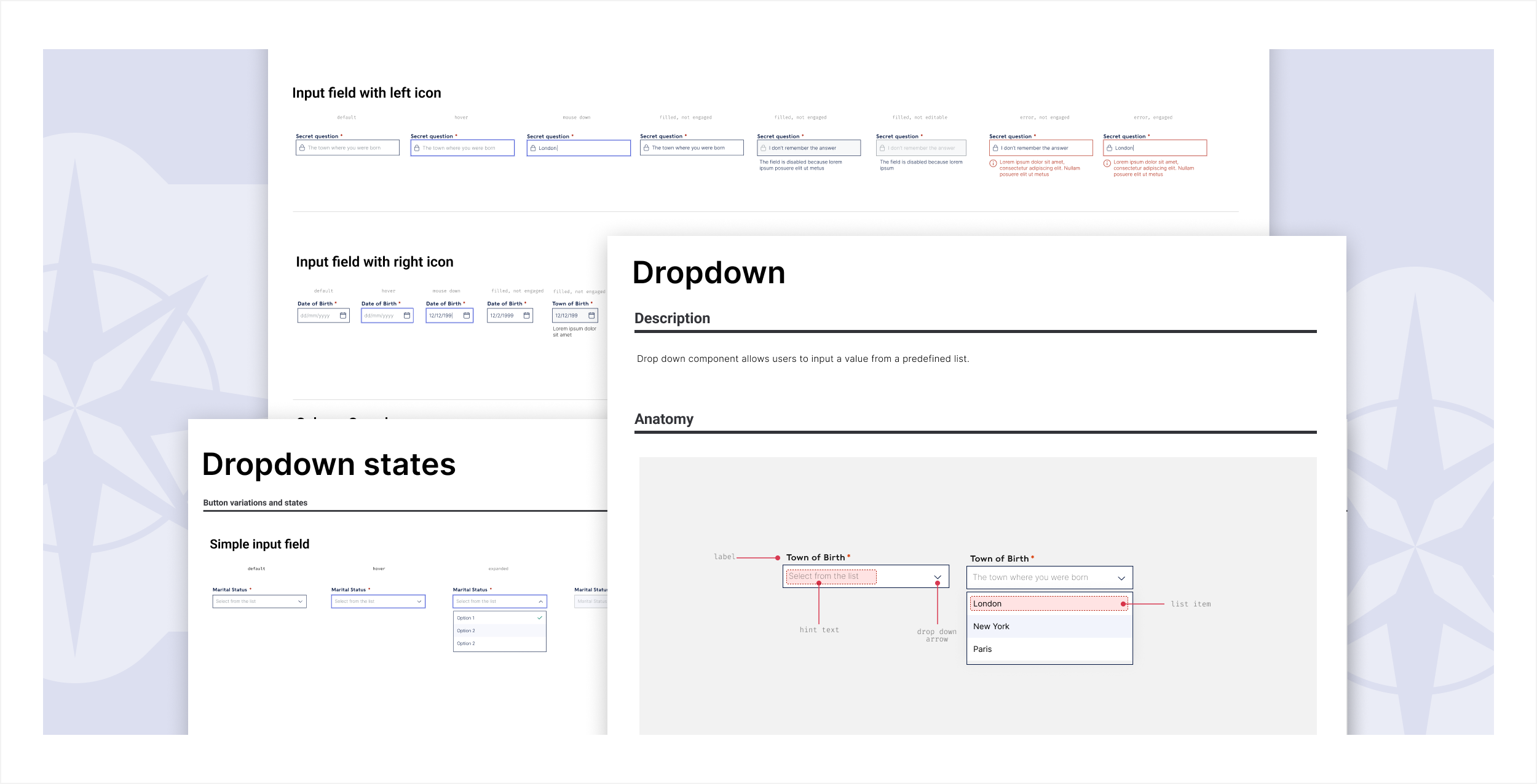
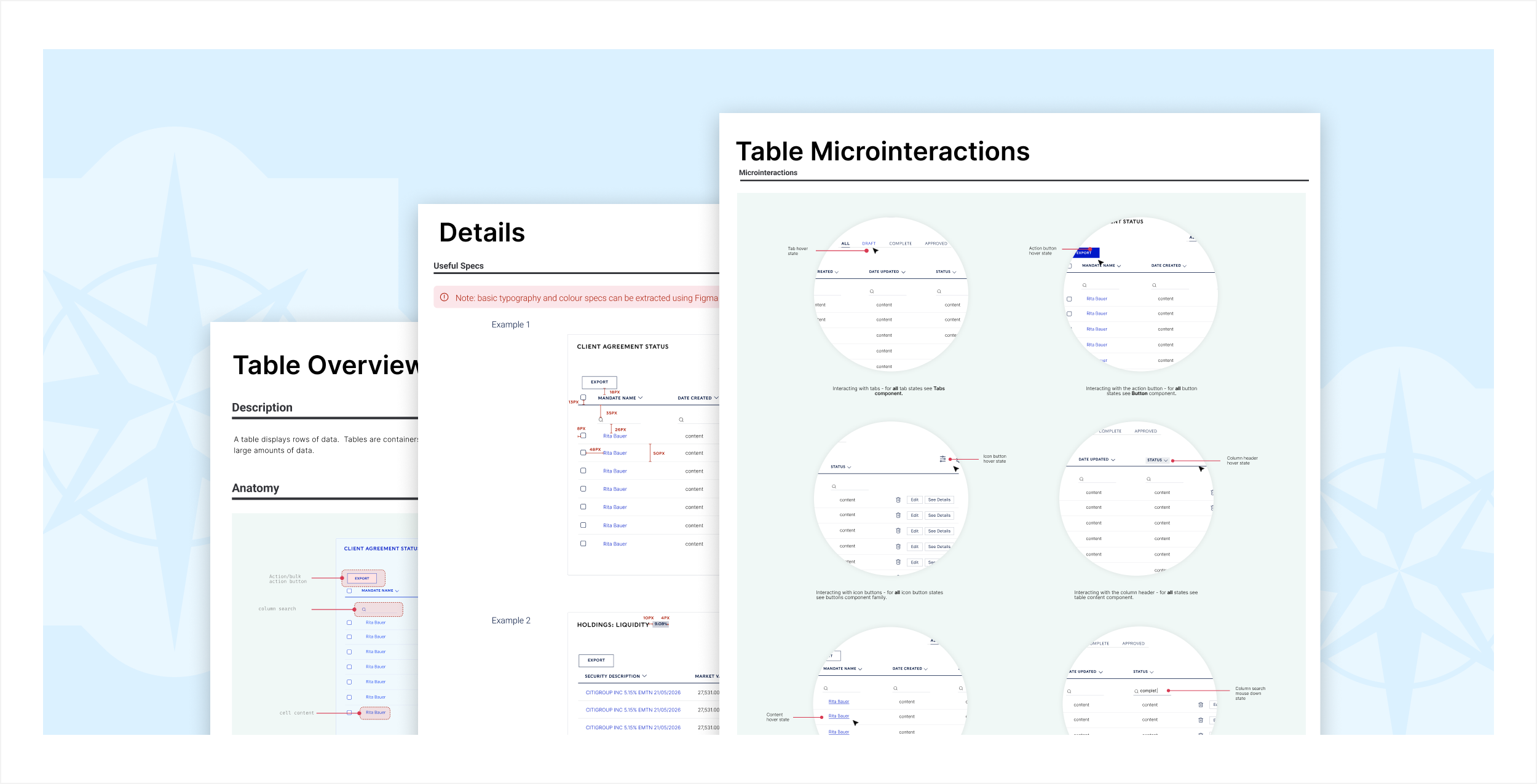
As anticipated, one of the most time-consuming phases was developing the component architecture and working on components. While I appreciate Google's Atomic Design methodology, I adapted it slightly, organising the system into simple components, complex components, and design patterns.
As with all of my UX work, I paid particular attention to microinteractions. I also collaborated closely with vendors and their development teams to ensure that all proposed changes were feasible. Although the initial objective was to make the components more aligned with Rathbones' brand, I used this initiative as an opportunity to enhance overall usability as well.
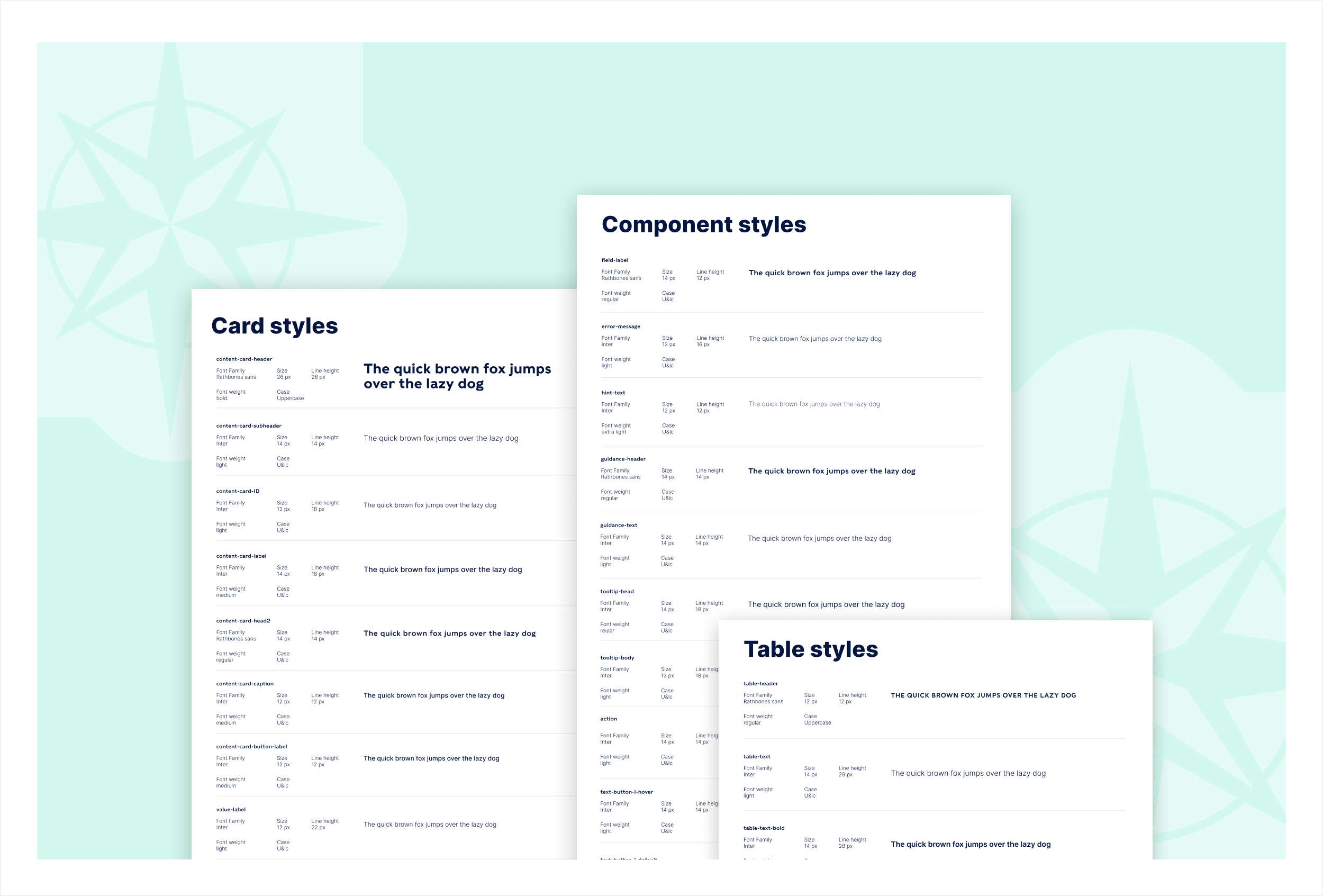
One of the limitations of this project was the predefined font set by the agency, that comes with just in 3 weights and is quite expanded. However, I successfully persuaded stakeholders to introduce a secondary font, Inter, which was not initially included in the branding guidelines. It offers improved readability and rendering, especially on Windows.
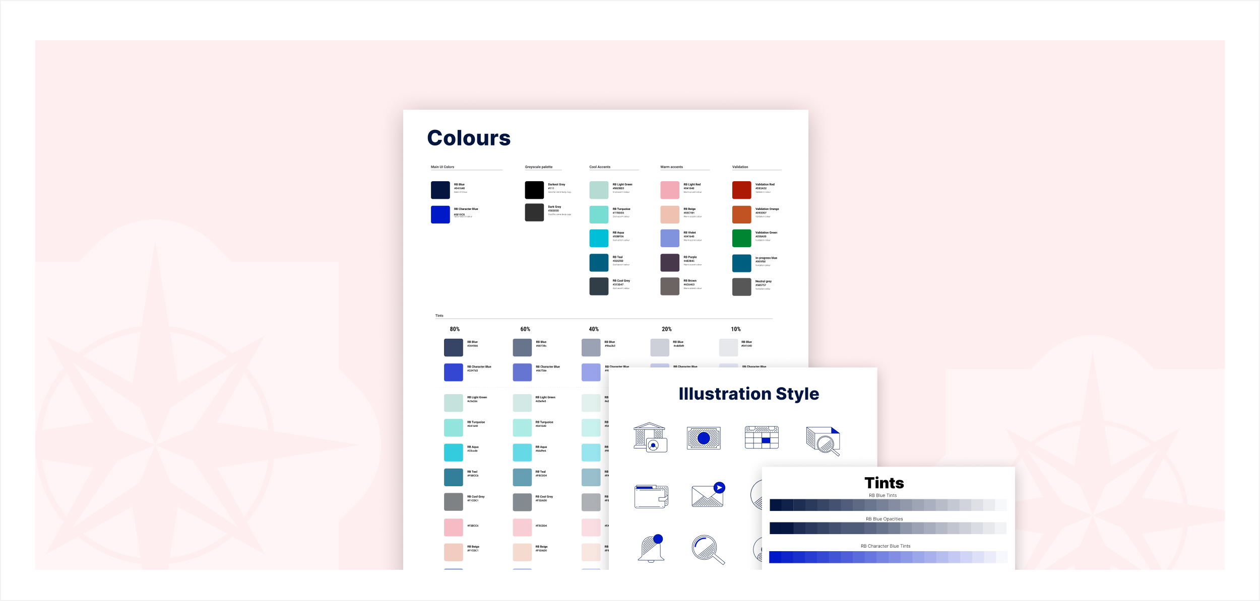
Additionally, I expanded the colour palette to better address the product's requirements, enabling the clear display of complex data visualizations and distinct error messages. I also art-directed the agency in creating a new illustration style. Together, we developed a set of icons designed to enhance the user experience and align seamlessly with the product's visual identity. When I worked with the agency, I made sure they are customisable via CSS, just in case the company has to go through another branding initiative.
What’s next?
Currently, I am focusing on closely collaborating with vendors to implement the new components, using them as building blocks to update and create new client initiatives for Rathbones. I am a strong advocate of evidence-based design and will be working closely with data analytics to understand how product changes impact client engagement.